
The -tag- on these bags was the primary focus of this project. I created them to help show all the information that any hardcore coffee lover would want or need. The hierarchy of this -tag- was very important to make the information readable and pleasing to look at. The majority of the hierarchy was accomplished through font size and weight with the country being the most important.
The region and the roast date both were the same weight for clarification on where it was produced and because the roast date will be one of the first things people will want to check besides the country of origin. The other four attributes as well as the varietals will only be important for the most hardcore of coffee nerds and as such were the lowest on the hierarchy while still giving adequate space for readability.
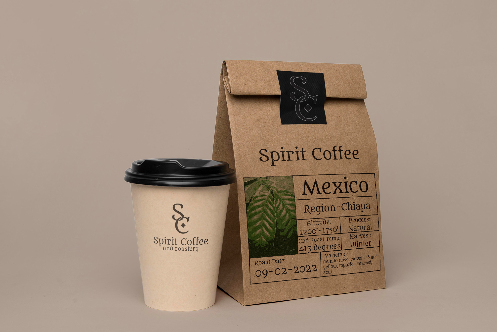
The logo would be incorporated on both the coffee cup and the coffee bag to maximize the area given to it. On the cup, the full name is added because there is more space, and unlike the bag, it is more likely to be seen by other people.
This mockup was rendered in photoshop to help illustrate how the end product of this design would work in real life. Ideally the design would be printed on the bag so that the texture of the brown paper would show through the ink. This is an important part of the design as it shows how Spirit Coffee is a green company that is environmentally minded.
The name Spirit Coffee was chosen because for many people, like me, making and drinking coffee can be a spiritual experience. This font was chosen because of the angular nature of the serifs and some of the letters remind me of blackletter font while still being a contemporary font. This font has a lot of personality that fits with the branding of Spirit Coffee. The logo was kept simpler to focus on the coffee roasting.