
Welcome
I’m Nathan, a graphic designer with a focus on front-end web development. I’m looking to create effective solutions for your brand.
I’m Nathan, a graphic designer with a focus on front-end web development. I’m looking to create effective solutions for your brand.
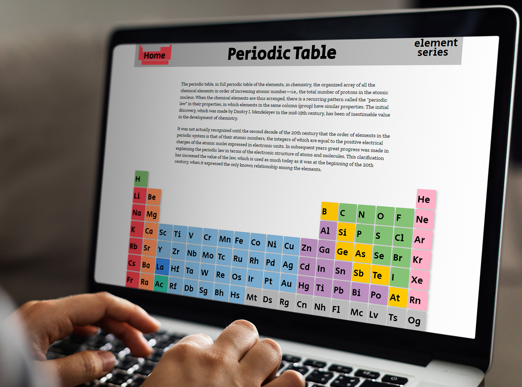
This project was my first foray into creating websites and using HTML, CSS and even attempting to incorporate Java to create some of the effects of the website. The sparse decorations of the website were meant to allow the colorful table to remain the most important part as the strong focus. The interactive design of the table is meant to encourage learning and exploration. I would have liked to give each element their own page but due to the limited time given for the project; only the families were able to get their own unique pages.
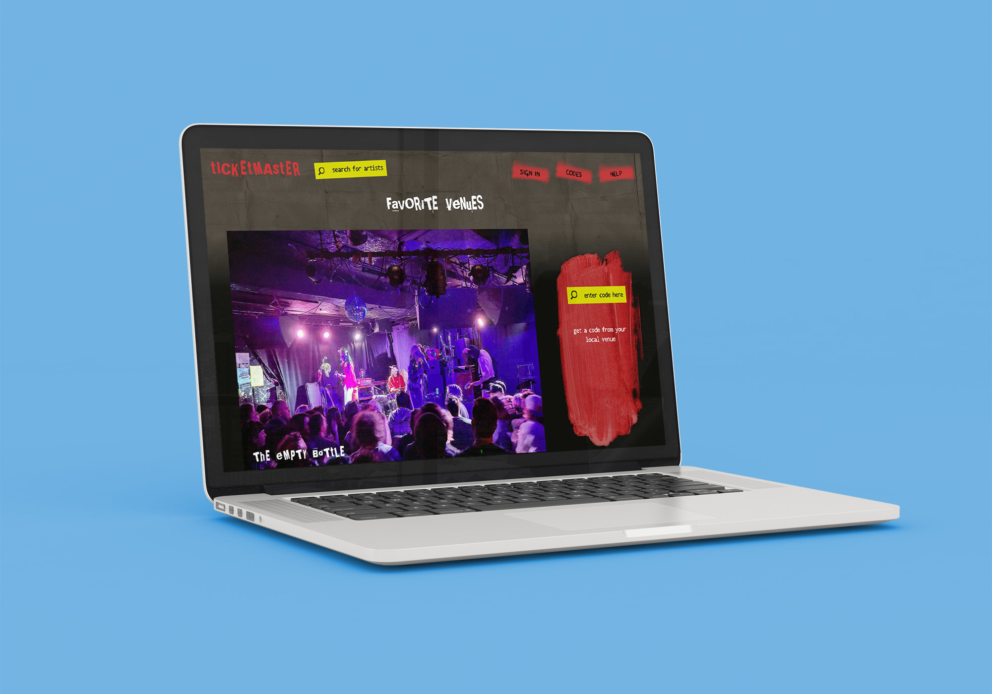
This is a rebranding of the company, Ticketmaster. I decided to narrow down the target audience to fans of punk music. A lot of the inspiration for this rebrand came from early punk style and album art like Sex Pistols' album "Never Mind the Bollocks, Here's the Sex Pistols" this was an exploration in website layout, so while there is no actual working website, each page has been a strong and effective image layout and example.
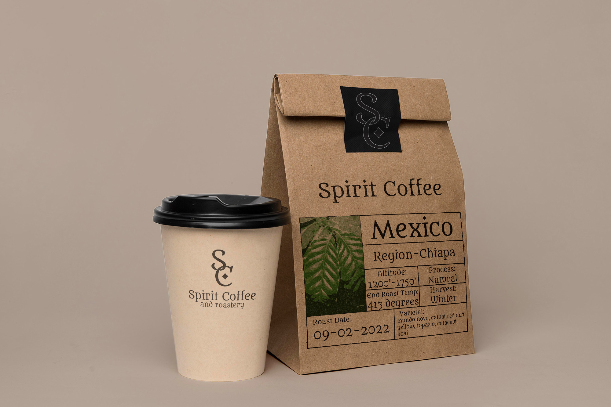
Spirit Coffee is a product branding series where I created a product line for the fictional company, Spirit Coffee. Spirit Coffee is focused on providing quality roasted coffee beans for coffee nerds like them. The packaging on the bag gives every detail about the beans, everything from where they are harvested to how hot they were roasted. The style of the labeling shows that the coffee is ethically sourced, and Spirit Coffee is environmentally minded.